


The Subscription Forms feature lets you build, style, and publish opt-in forms without writing any code. Each form is embedded on your WordPress site using a shortcode that renders a fully responsive layout. Fields automatically stack on narrow containers — sidebars, mobile screens, Gutenberg columns — without any extra configuration.
The Forms List
Go to GemCRM → Forms to see all your forms.

The Forms list page. Click + Create Form in the top right to add a new form.
What you can see at a glance:
- Name — The form name. Click it to open the editor.
- Status — Active (green) or Inactive (grey). Inactive forms still render the shortcode but do not accept submissions.
- Double Opt-in — Yes or No, indicating whether email confirmation is required before a contact is added.
- Shortcode — The embed code for this form. Click the copy button to copy it to your clipboard.
- Created — How long ago the form was created.
- Action — Three-dot menu with options to Edit or Delete.
Filtering and searching:
- Status filter — Show All, Active, or Inactive forms.
- Sort by — Created Date, Updated Date, or Name.
- Order — Descending or Ascending.
- Search — Type to filter forms by name in real time.
Creating a New Form
Click + Create Form at the top right of the Forms list. A template picker opens automatically.
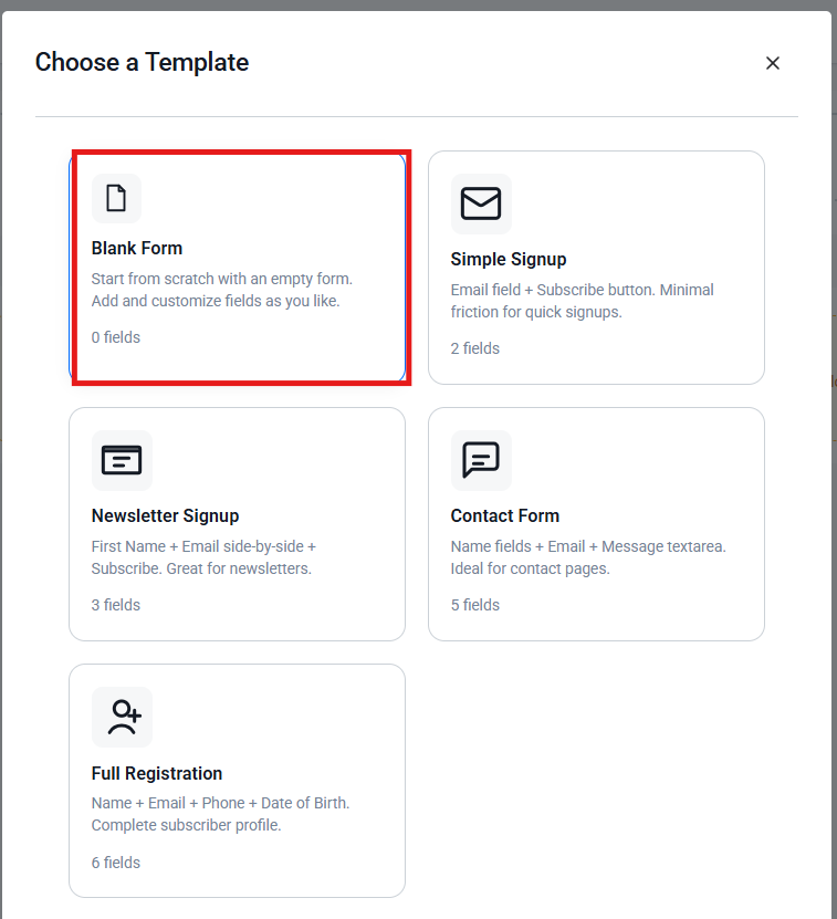
The template picker. Click a template to apply it, or choose Blank Form to start from scratch.
Available templates:
- Blank Form — Empty canvas, start from scratch.
- Simple Signup — Email and Subscribe button—minimal friction.
- Newsletter Signup — First Name and Email side by side, plus Subscribe button.
- Contact Form — First Name, Last Name, Email, Message textarea, and Subscribe button.
- Full Registration — First Name, Last Name, Email, Phone, Date of Birth, and Subscribe button.
Click a template card to apply it. All fields can be customised after applying. Note that applying a template replaces all current fields on the canvas, so use templates before you start editing.
Editing a form: Click the form name in the list, or choose Edit from the three-dot action menu.
Deleting a form: Click the three-dot menu → Delete. A confirmation dialogue appears before the form is removed. This action cannot be undone.
The Form Builder
When you open or create a form, you see three panels.
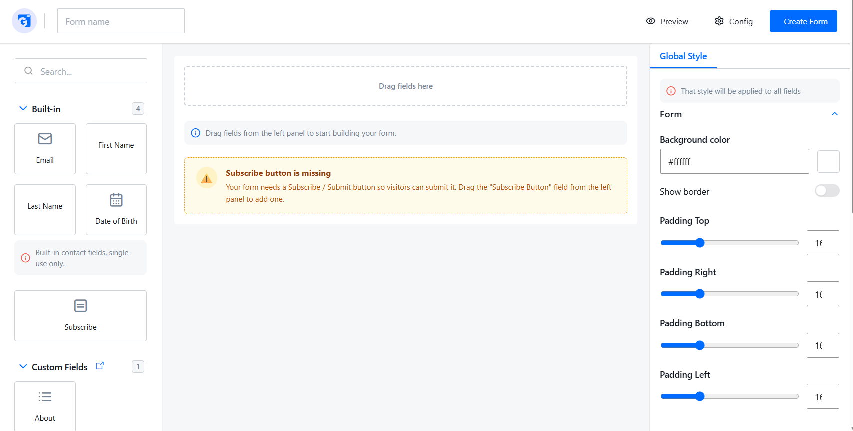
The form builder has an empty canvas. The left panel shows available fields, the centre is the canvas, and the right panel shows Global Style settings. The yellow warning reminds you to add a Subscribe button before saving.
- Left — Field Picker: All available fields. Drag them onto the canvas.
- Centre — Canvas: Your form as it is being built. Click a field to select it.
- Right — Settings: Field settings when a field is selected; Global Style when nothing is selected.
The top bar contains the form name input, the shortcode copy button (edit mode only), and the Preview, Config, and Save buttons.
Building and Editing Your Form
Once you have added fields to the canvas, the form builder shows a live preview of your form.
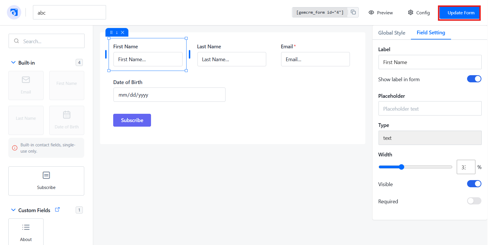
An example form with an Email field and Subscribe button added. The shortcode [gemcrm_form id="3"] appears in the top bar, ready to copy. Click Update Form to save changes.
Field Picker (Left Panel)
Built-in fields — Standard contact data fields, each usable only once per form:
- Email — Always required and cannot be removed.
- First Name — Text input.
- Last Name — Text input.
- Date of Birth — Date picker.
A field already on the form appears greyed out in the picker and cannot be dragged again.
Subscribe button — The form submission button. Only one Subscribe button is allowed per group.
Custom Fields — Any fields you have created in Settings → Custom Fields appear here. Click the arrow icon next to the “Custom Fields” heading to go directly to that settings page.
Use the search box at the top of the left panel to filter all fields by name.
Adding Fields
- Find the field in the left panel.
- Click, hold, and drag it onto the canvas.
- Blue drop zones appear as you drag — drop left or right of an existing field to place them in the same row (widths redistribute equally), or above or below to give the field its own full-width row.
Moving a Field
Select it, then use the ↑ / ↓ arrows to move one position up or down, or use the drag handle (⠿) to reposition it anywhere on the canvas.
Resizing a Field
Select it, then drag the blue handles on the left or right edges. Width snaps to 25%, 33%, 50%, 67%, 75%, or 100%. You can also type an exact value (5–100%) in the Width field in the right panel.
Removing a Field
Select it, then click the ✕ button in the toolbar above it. The Email field cannot be removed.
Field Settings (Right Panel)
Click any field on the canvas to open its settings.
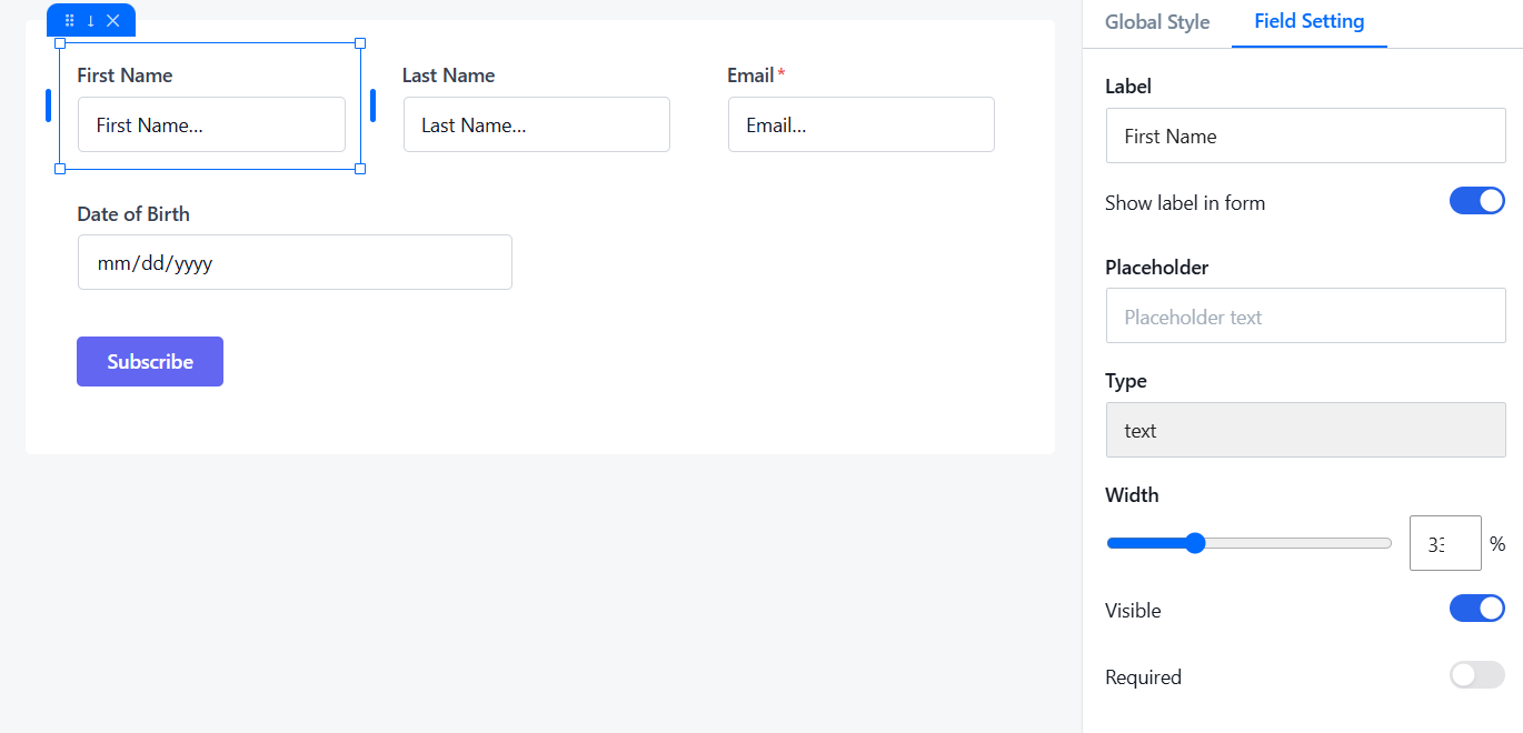
Regular fields:
- Label — Text shown above the input on your published form.
- Show label in form — Toggle off to hide the label.
- Placeholder — Grey hint text inside the input before the user types.
- Width — Field width as a percentage of the row (5–100%).
- Visible — Toggle off to hide this field from the published form.
- Required — Toggle on to make the field mandatory. A red asterisk (*) appears next to the label.
Subscribe button:
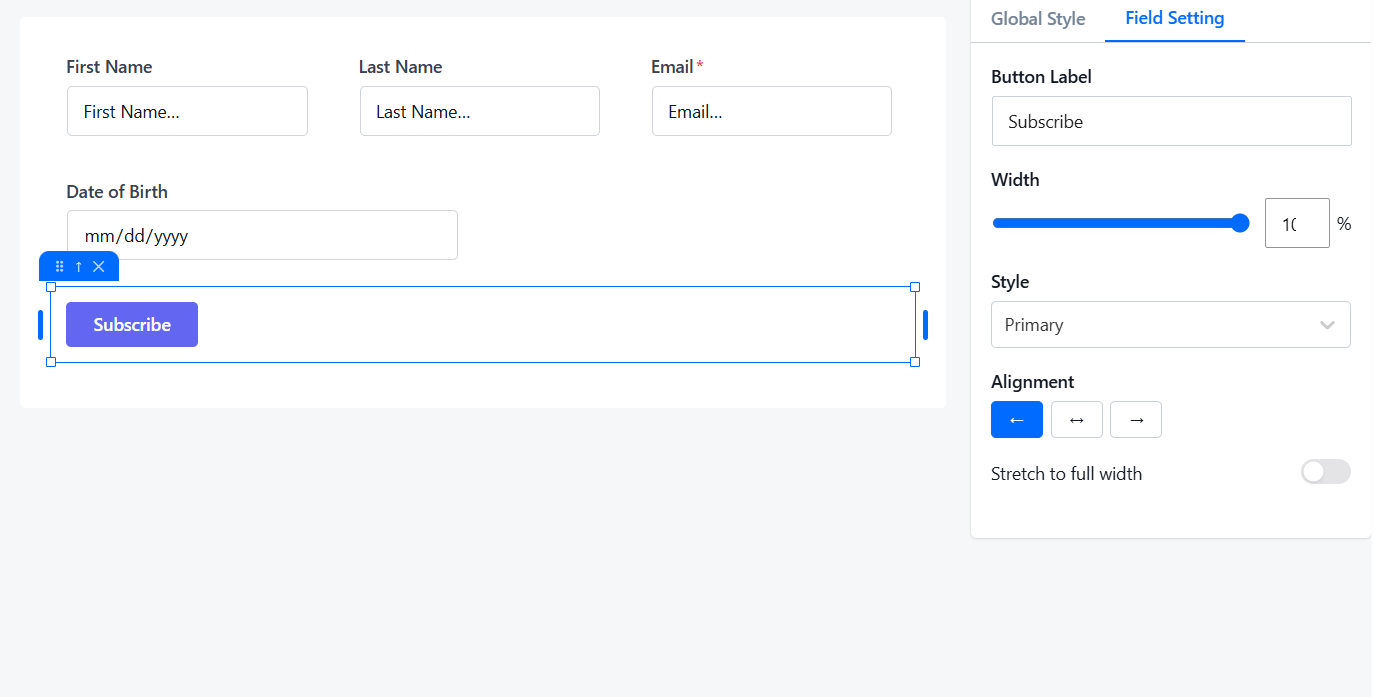
- Button Label — Text on the button (e.g., “Subscribe”, “Sign Up”, “Send”).
- Width — Width of the button container (5–100%).
- Style — Primary (solid filled), Secondary (outlined with thick border), or Outline (outlined with thin border).
- Alignment — Position the button left, centre, or right within its container.
- Stretch to full width — Makes the button fill its full container width, overriding alignment.
Global Style (Right Panel)
Click anywhere on the canvas background (or deselect all fields) to switch the right panel to Global Style. Changes are shown live on the canvas.
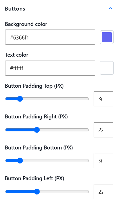
Form: Background color, border visibility, border width, border color, and padding (top, right, bottom, left — 0–60 px each, default 16 px).
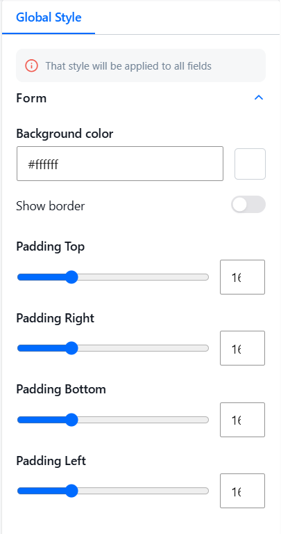
Inputs: Background color, label color, text color, placeholder color, border color, and border width.
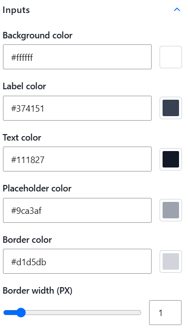
Buttons: Background color, text color, and button padding (top, right, bottom, left — 0–60 px each)
Form Configuration (Config)
Click Config in the top bar to set up what happens when someone submits the form
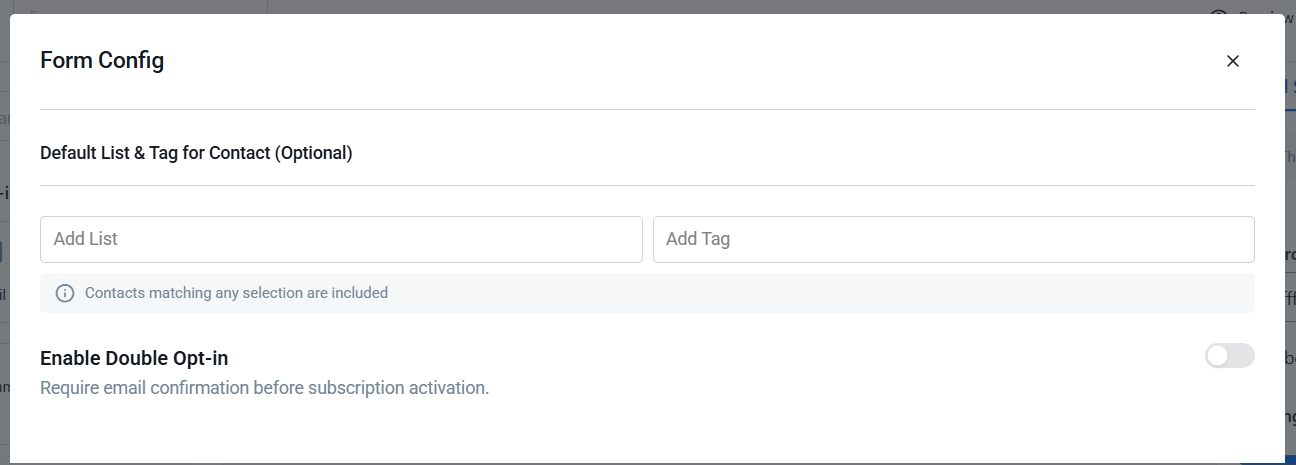
- Contact Lists — Choose which contact lists new subscribers are added to.
- Tags — Choose which tags are automatically assigned to new subscribers.
- Enable Double Opt-in — When on, new subscribers receive a confirmation email and must click the link before they are added to your lists.
Previewing Your Form
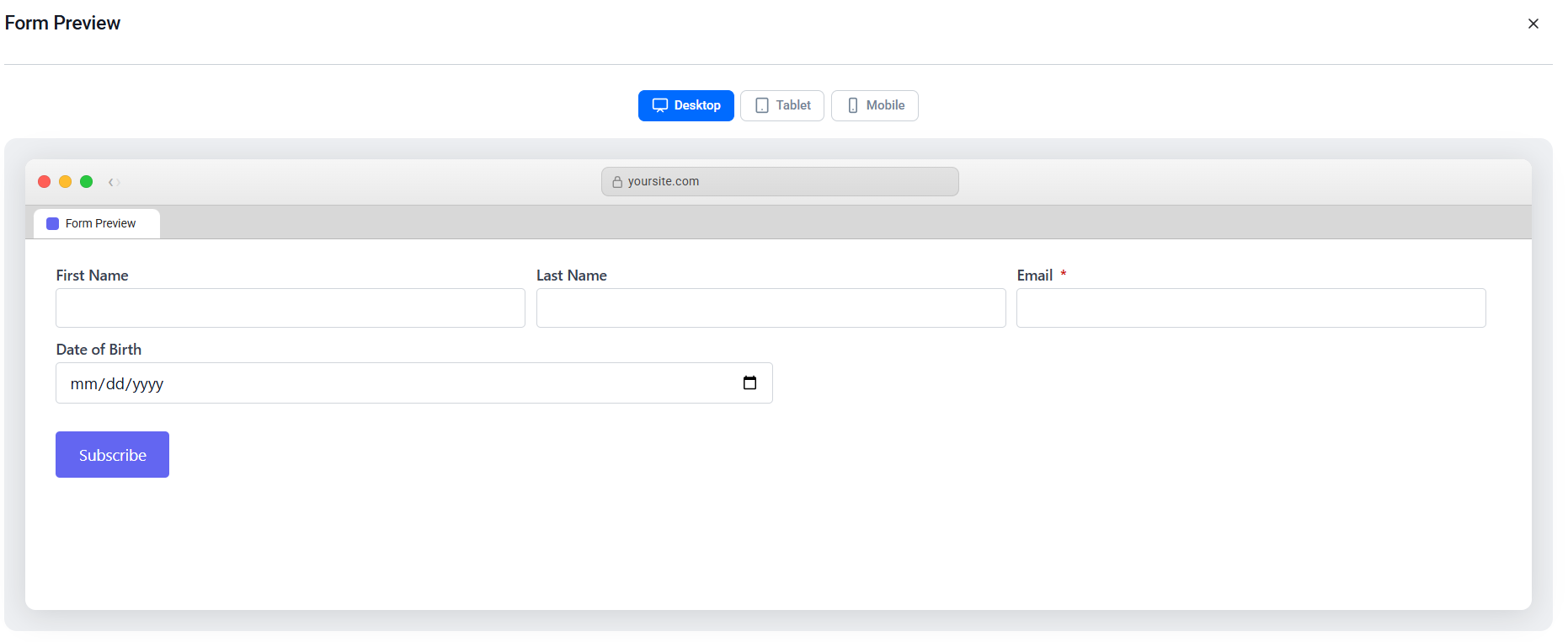
Click Preview in the top bar. A modal opens showing the exact rendered output with all current styles applied. Use the Desktop / Tablet / Mobile toggle to see how the form looks at different screen sizes. No changes are made by viewing the preview.
Saving Your Form
- Click Create Form to save a new form. You will be redirected to the edit view, and the shortcode will appear in the top bar.
- Click Update Form to save changes to an existing form.
- Press Ctrl+S (Windows/Linux) or Cmd+S (Mac) to save at any time without using the mouse.
If the form name field is empty, saving will show an error, and the form will not be saved.
Embedding a Form in Posts and Pages
After saving, copy the shortcode from either the Forms list (Shortcode column) or the form builder top bar. The format is:
[gemcrm_form id="123"]
Block editor: Add a Shortcode block, paste the shortcode, then click Update or Publish.
Classic editor: Paste the shortcode anywhere in the content area, then click Update or Publish.
Widget areas (sidebars, footers): Go to Appearance → Widgets, add a Shortcode widget, paste the shortcode, and save.
Page builders (Elementor, Divi, etc.): Add a Shortcode element and paste the shortcode into it.
How the Form Looks on Your Site
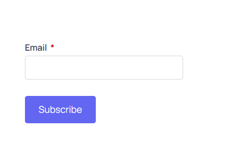
A published form on the frontend — Email field with a required asterisk and a Subscribe button, rendered cleanly on the page.
Responsive behaviour: The form uses CSS flexbox with inline styles. Fields automatically wrap to a new row when the container is too narrow — no media queries or JavaScript needed. A field set to 1/2 width wraps below approximately 400 px container width; a 1/3-width field wraps below approximately 600 px.
Tips and Common Questions
Can I have the same field twice?
No. Built-in fields can only appear once per form and are greyed out in the picker after being added.
Can I have more than one Subscribe button?
No. Only one is allowed per group. If a group is missing a button, a warning appears on the canvas.
What happens if I apply a template to a form I’ve already edited?
The template replaces all current fields. Apply templates to new forms, or before you begin editing.
Can I create custom fields?
Yes. Go to Settings → Custom Fields. Once created, they appear in the field picker and can be dragged onto any form.
Will visitors see hidden fields?
No. Fields with Visible turned off are completely removed from the published form. They remain visible in the builder (faded) so you can re-enable them later.
My form is inside a narrow sidebar — will it look broken?
No. The form automatically stacks fields into a single column when the container is too narrow, with no extra setup needed.