


You publish a great guide. Hundreds of people read it, nod along, and leave. A week later you can’t email a single one of them, because you never asked, and nothing on the page made asking easy.
That is the gap an opt-in form fills. It’s a small box on your site that turns “someone who read my post” into “someone who agreed to hear from me again.” It looks minor, but it’s often the only bridge between anonymous traffic and an audience you actually own.
This guide explains what an opt-in form is, how it works, which types to use where, and how to build one that earns signups without annoying visitors.
Quick Overview of Opt-In Form
What Is an Opt-In Form?
An opt-in form is a web form where a visitor voluntarily gives you contact details, usually an email address and sometimes a name or phone number, and agrees to receive communication from you.
Two things make it an opt-in form rather than just a form:
Permission matters for practical and legal reasons. Under the GDPR, a controller must be able to demonstrate that consent was given, and the request should be clearly distinguishable from other matters and written in plain language. The UK ICO adds that pre-ticked boxes and silence do not count as consent. Even beyond the law, people who asked to hear from you open, click, and complain less than people who didn’t.
How an Opt-In Form Works
The flow is simple:
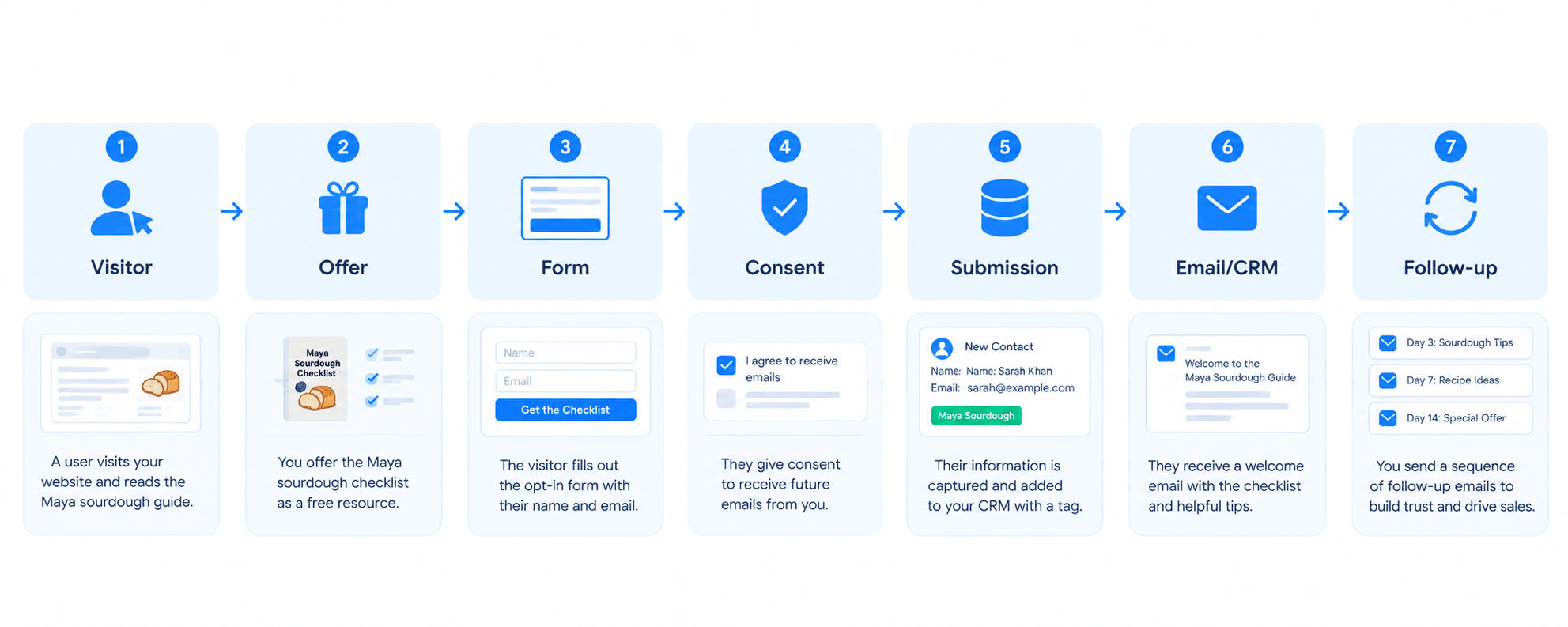
Visitor → Offer → Form → Consent → Submission → Email/CRM → Follow-up
Here’s an example. Maya runs a small online baking course. A visitor reads her post on sourdough starters and sees a box that says, “Get the free 7-day starter troubleshooting checklist.” They type their first name and email and click the button. The form sends those details to Maya’s email tool or CRM, where the person is stored as a contact on a “Sourdough Checklist” list. A welcome email delivers the checklist, and a short follow-up series introduces her course over the next two weeks.
Every step has a job. The offer motivates, the form collects, consent makes the relationship legitimate, and the CRM connection makes sure the follow-up actually happens. A form that isn’t connected to anything is just a decoration.
Quick Comparison
These terms are used interchangeably online, but they describe slightly different things:
|
Type |
Main purpose |
What it usually captures |
Best use |
|
Opt-In Form |
Get permission and grow an audience |
Email, sometimes name |
Newsletter, lead magnet, subscriptions |
|
Email Signup Form |
Subscribe someone to email updates |
Email, sometimes name |
Newsletter and email lists |
|
Lead Capture Form |
Capture information from a potential lead |
Name, email, phone, company, etc. |
Sales leads, demos, consultations |
|
Lead Capture Page |
Create a dedicated page for capturing a lead |
Usually through an embedded form |
Campaigns, paid traffic, lead magnets |
|
Lead Magnet Landing Page |
Exchange a valuable resource for contact information |
Usually name + email |
Ebooks, checklists, templates, guides |
In practice these overlap heavily. An email signup form is nearly always an opt-in form. A lead magnet landing page is a type of lead capture page, which in turn contains a form. The useful distinction is what each one is for: permission, sales information, or a complete page built around one offer.
Why Are Opt-In Forms Important?
You build an audience you own. Social reach and search rankings can change overnight. An email list doesn’t depend on an algorithm.
You capture visitors who would otherwise leave. Most first-time visitors aren’t ready to buy. A form gives them a low-commitment next step.
You start a relationship. The first email after signup is usually the most-read message you’ll ever send that person. It sets expectations for everything after it.
You can deliver lead magnets. The form is the mechanism that trades a resource for permission.
You can nurture over time. Once someone is a contact, you can send a sequence of helpful emails instead of hoping they return.
You can automate and personalize. Tags, lists, and form data let you send different follow-ups to different people. That’s the foundation of email marketing automation.
You can communicate later. Product launches, new content, and offers all have somewhere to go.
Opt-In Form vs. Lead Capture Form
Lead capture forms are the broader category. An opt-in form is a lead capture form whose main job is to get permission to communicate. A lead capture form might also ask for information a salesperson needs.
|
Quick Overview |
Opt-in form |
Lead capture form |
|
Primary goal |
Permission to email |
Information about a prospect |
|
Typical fields |
Email, maybe first name |
Name, email, phone, company, budget, etc. |
|
Typical follow-up |
Welcome email, newsletter, nurture series |
Sales call, quote, demo, consultation |
|
Typical offer |
Newsletter, guide, discount |
Demo, quote, consultation |
|
Friction tolerance |
Low (every extra field hurts) |
Higher (visitors expect to share more for a demo) |
A newsletter box is clearly an opt-in form. A “Request a quote” form with a phone number and project details is a lead capture form. A free-guide form with just name and email sits in the middle, and it’s fine to call it either one.
Types of Opt-In Forms
Inline Opt-In Forms
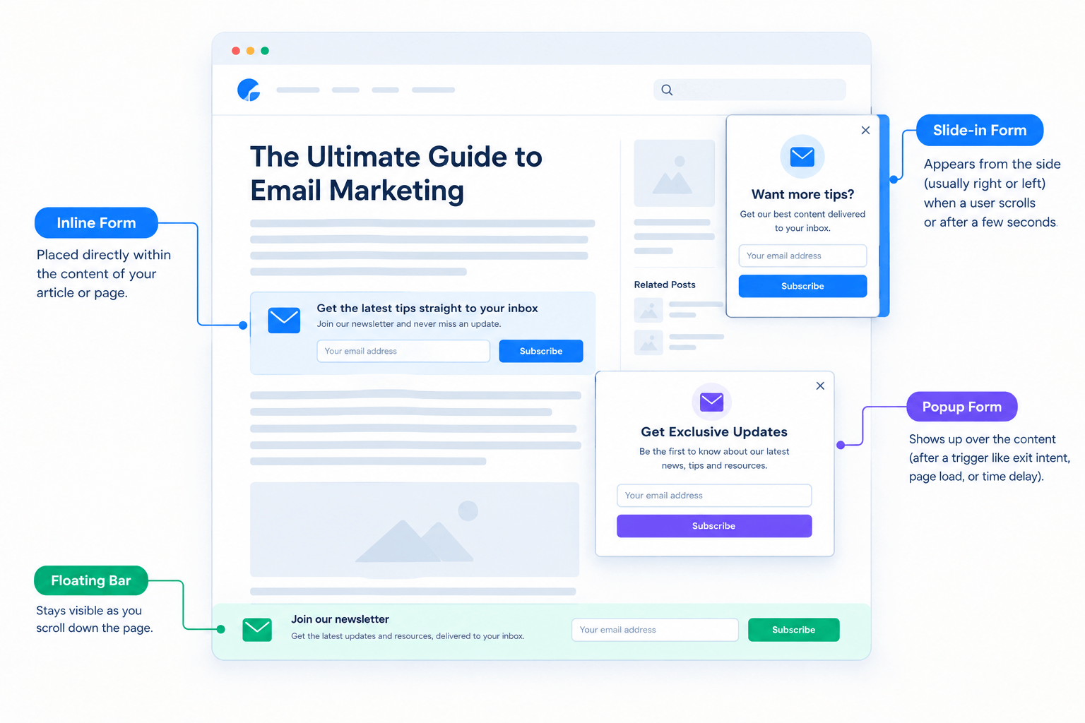
What it is: A form placed directly in the page content, such as mid-article or after a post. Best use case: Blog posts, guides, and tutorials where the offer matches the topic. Example: A “Download the printable version” box after a recipe. Potential drawback: Visitors who skim past it never see it.
Popup Opt-In Forms
What it is: A form in a window that appears over the page, triggered by time, scroll depth, or an action. Best use case: Time-sensitive offers, newsletter promotions, and ecommerce discounts. Example: A “10% off your first order” window after 20 seconds on a store page. Potential drawback: Poorly timed popups interrupt reading and frustrate people, especially on mobile.
Slide-In Forms
What it is: A smaller box that slides in from a corner of the screen, often after a visitor scrolls partway. Best use case: Long articles, where a content upgrade appears once someone is clearly engaged. Example: A slide-in offering a checklist after 60% scroll. Potential drawback: It can cover content or buttons on small screens.
Floating Bar Forms
What it is: A thin bar fixed to the top or bottom of the page. Best use case: Always-visible, low-pressure announcements like “Join 1 email a week.” Example: A top bar promoting a free shipping code for new subscribers. Potential drawback: Space is tight, so it only suits very short offers and one or two fields.
Fullscreen or Welcome-Mat Forms
What it is: A form that covers the whole screen, often on first arrival. Best use case: Big launches, giveaways, or events where the offer is the main message. Example: A fullscreen “Join the waitlist” screen before a product release. Potential drawback: It’s the most intrusive format. If the offer is weak, it blocks people from the content they came for.
Exit-Intent Forms
What it is: A form shown when the visitor’s cursor moves toward closing the tab or leaving the page. Best use case: Last-chance offers to visitors who were about to leave anyway. Example: A “Before you go, get the checklist” window on a pricing page. Potential drawback: Exit detection is mostly a desktop behavior, so mobile needs a different trigger such as scroll or inactivity.
Landing-Page Opt-In Forms
What it is: A form on a stripped-down page with one purpose and one offer. Best use case: Paid traffic, social campaigns, webinar signups, and lead magnets. Example: A page for a free email course with a headline, three benefits, and a short form. Potential drawback: It needs its own traffic, because people won’t stumble onto it the way they do a sidebar box.
What Should an Effective Opt-In Form Include?
A Clear Value Proposition
Say what the visitor gets and why it matters, in one line. “Subscribe to our newsletter” is a task. “Get one practical WordPress tip every Tuesday” is a benefit.
A Relevant Offer
The offer should match what the person was just reading. Someone on a post about email subject lines wants a subject-line swipe file, not a generic ebook about business growth.
Only Necessary Form Fields
Every field is a decision. For a newsletter, email alone is often enough. If you want to greet people by name in follow-ups, add first name. Ask for company or phone only when you will genuinely use it.
A Specific CTA
“Submit” tells people nothing. “Send me the checklist” or “Get the template” tells them what happens next.
Trust and Privacy Information
A short line under the button, like “No spam. Unsubscribe anytime,” reduces hesitation. If you collect more than an email, link to your privacy policy. Say clearly what the visitor will receive and how often.
Mobile-Friendly Design
Many visitors will see your form on a phone. Fields should be large enough to tap, buttons easy to hit, and popups easy to close. A form that can’t be dismissed on mobile will cost you more than it gains.
Lead Magnets and Opt-In Forms: How They Work Together
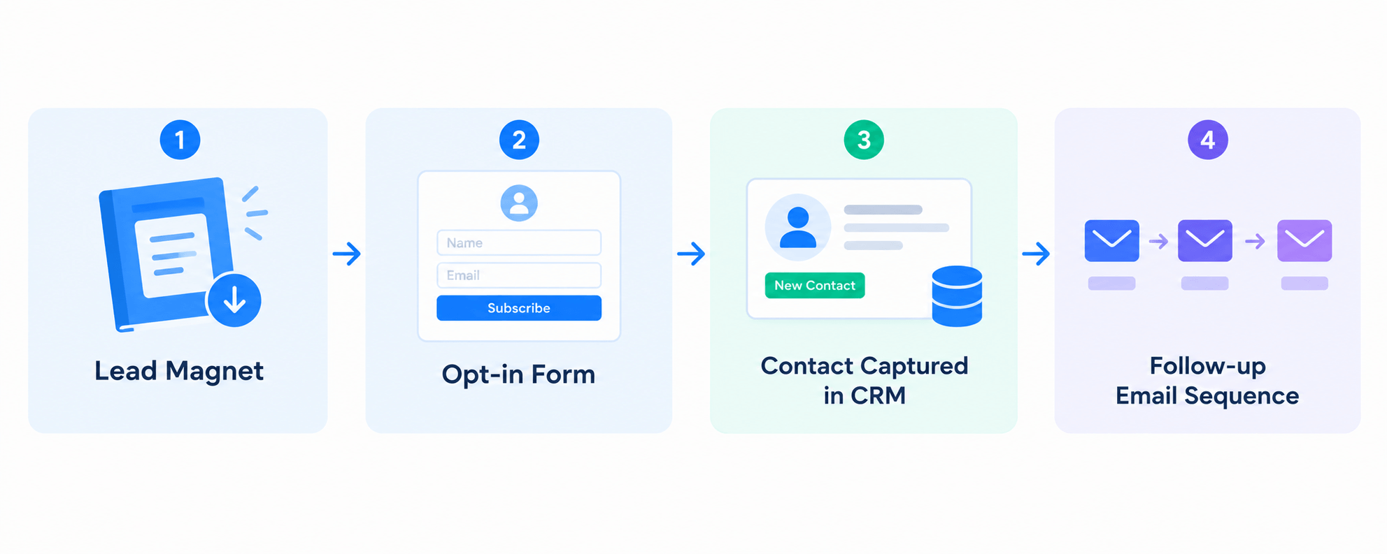
A lead magnet is something useful you give away in exchange for contact details. The opt-in form is how the exchange happens:
Lead magnet → Opt-In Form → Contact Capture → Follow-Up
You don’t need a lead magnet for an opt-in form. A newsletter with a clear promise works fine. But a concrete, immediately useful offer often gives people a stronger reason to sign up than “stay in touch.”
Common Lead Magnet Examples
Choose whichever solves a real problem for your audience, and make sure it can be delivered automatically the moment someone signs up.
Opt-In Form vs. Lead Capture Page
A form is a conversion element. A page is the entire conversion environment around it: headline, benefits, proof, and design. Some people call a page with one offer and one form a lead magnet landing page, and it’s really a specific kind of lead capture page.
When to Use a Form on a Page
Use a form inside existing content when visitors are already engaged and the offer is simple:
The page already provides the context, so the form doesn’t need to explain much.
When to Use a Dedicated Lead Capture Page
Use a dedicated page when the visitor arrives because of the offer and needs persuading:
A good rule: if the visitor already understands the offer from the surrounding content, a form is enough. If they need convincing, build a page.
7 Opt-In Form Examples and When to Use Them
1. Newsletter signup
2. Lead magnet download
3. Ecommerce discount
4. Webinar registration
5. Content upgrade
6. Exit-intent offer
7. Free trial, demo, or waitlist
How to Create an Opt-In Form
This process works with most WordPress form tools and email platforms.
1. Define the Goal
Decide what the form should achieve: newsletter subscribers, lead magnet downloads, webinar registrations, or demo requests. One form, one goal.
2. Choose the Offer
Pick something your audience wants right now. If you can’t explain the offer in one sentence, it’s too vague.
3. Select the Form Type
Match format to context. Inline works for blog readers, popups for time-sensitive offers, and a landing page for campaigns. Start with the least intrusive format that fits.
4. Write the Copy
Write a benefit-led headline, one or two lines of description, a specific button label, and a short privacy line. Say what happens after signup.
5. Keep the Fields Minimal
Start with email, adding first name only if you’ll use it. Add more only when each field has a purpose.
6. Connect Your Email or CRM System
This is the step people forget. Decide which list the contact joins and which tags they receive, so you can segment them later.
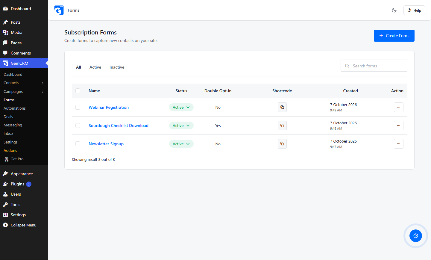
In GemCRM, go to GemCRM → Forms and click Add New Form. You can start from a template such as Simple Signup (email plus a Subscribe button) or Newsletter Signup (first name and email), then drag fields on the canvas. Under Config, choose the contact lists and tags new subscribers receive automatically, and decide whether to enable double opt-in. Save, copy the generated shortcode, and paste it into a post, page, widget, or page builder. (Subscription Forms documentation)
7. Set the Confirmation and Follow-Up
Decide what the visitor sees immediately after submitting, then what arrives in their inbox. At minimum, send a welcome email that delivers the promised offer and repeats what they’ll receive. A simple automated email sequence can then continue the conversation. In GemCRM, contacts can enter a sequence when they join through a subscription form, a tag, or a manual add.
8. Test the Form
Submit it yourself on desktop and phone. Check that the contact appears in your CRM with the right list and tags, the welcome email arrives (and not in spam), and any confirmation link works. Test again after any change.
Where Should You Place an Opt-In Form?
Placement depends on what the visitor is doing. These placements all support email signup forms, but they serve different moments.
Blog Posts
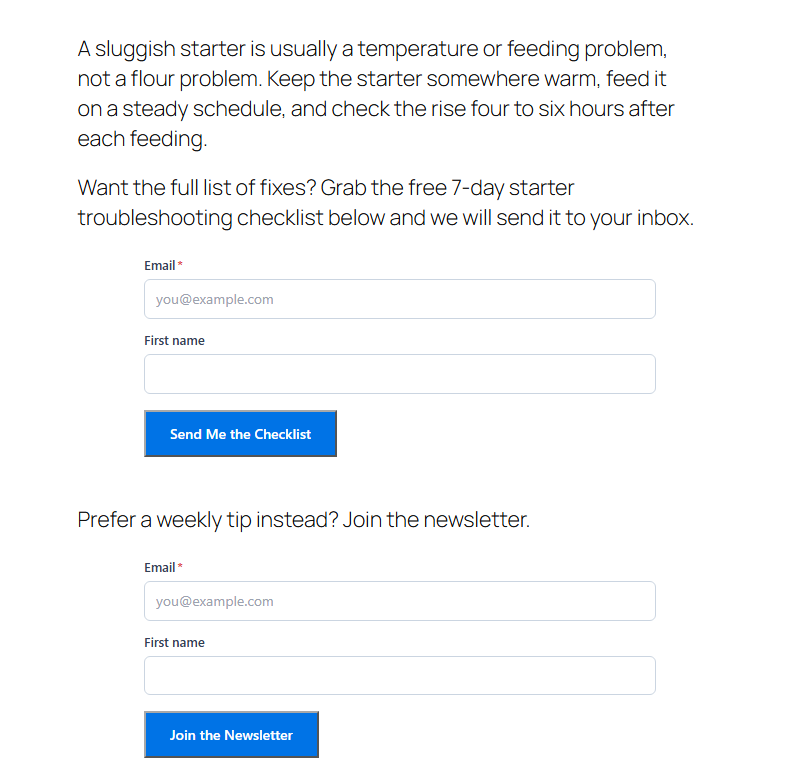
Inline forms within or after a post work well when the offer relates to the article. It’s the natural home for content upgrades.
Homepage
Visitors arriving at your homepage may be new and unsure. A clear newsletter or lead magnet form above or below the fold gives them a low-pressure way to stay in touch.
Sidebar or Footer
These are always available, but they’re passive. They suit a general newsletter signup, not a high-value offer.
Product Pages
A form here should relate to the product, such as a size guide, buying checklist, or restock alert. Avoid unrelated offers that distract from purchasing.
Landing Pages
When traffic comes from ads, social posts, or email, a landing page keeps the focus on one action.
Popups and Exit Intent
Useful for time-sensitive offers or visitors about to leave, but only if timing and relevance are carefully handled.
No placement is universally best. Test two or three and let your own data decide.
Single Opt-In vs. Double Opt-In
|
Quick Overview |
Single opt-in |
Double opt-in |
|
Signup process |
Submit form → added immediately |
Submit form → confirmation email → click link → added |
|
Friction |
Low |
Higher (one extra step) |
|
Confirmation |
None required |
Email address verified by click |
|
Subscriber experience |
Fast, simple |
Slightly slower; some people never confirm |
|
List quality |
Can include typos or fake addresses |
Typically cleaner list with confirmed addresses |
|
Record of consent |
Depends on what you log |
Confirmation click gives an extra record |
|
May fit |
Newsletters, content upgrades, low-risk offers |
Compliance-sensitive audiences, or when list quality matters most |
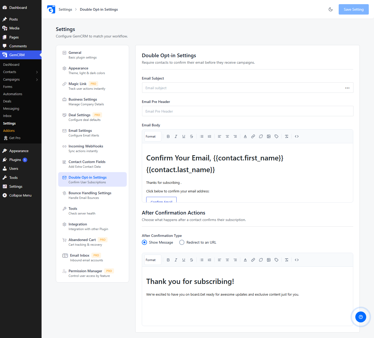
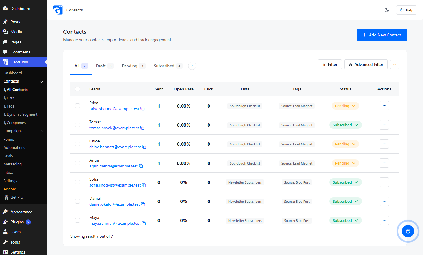
In GemCRM, a double opt-in form creates the contact with a Pending status. The contact becomes Subscribed after they click the confirmation link. The confirmation email’s subject, pre-header, and body are edited under GemCRM → Settings → Double Opt-in Settings, where you can also choose whether the visitor sees a message or is redirected to a URL after confirming. (Double Opt-in documentation)
Which One Should You Use?
Neither is automatically correct.
On the legal side: The GDPR requires that you can demonstrate consent, but it doesn’t spell out double opt-in as a mandatory method. The ICO’s consent guidance, for example, focuses on a clear affirmative action, specific wording, and record-keeping rather than a confirmation email. In the US, the FTC’s CAN-SPAM guidance doesn’t require prior consent for marketing email but does require a clear opt-out, a valid physical address, and honoring opt-outs within 10 business days. Some countries and industries are stricter, so check the rules where your subscribers live. This is general information, not legal advice.
On the practical side:
Opt-In Form Best Practices
Offer a Clear Benefit
People sign up for a result, not a mailing list. State the benefit in the headline.
Ask for Less Information
Start with the minimum. Add a field only if you can name how you’ll use it.
Match the Offer to the Page
A relevant offer feels like a continuation of the content. An unrelated one feels like an interruption.
Use Action-Oriented CTA Copy
Verbs beat generic words. “Get my template” beats “Submit.”
Avoid Too Many Distractions
On a landing page, remove extra menus and links. On a content page, avoid stacking several popups at once.
Make Consent Clear
Say what people are signing up for and how often you’ll email. Don’t pre-tick consent boxes, and don’t bundle email consent with unrelated terms. Make unsubscribing easy: under GDPR, withdrawing consent should be as easy as giving it.
Optimize for Mobile
Preview on a phone, use readable text sizes, and make sure popups can be closed easily.
Test Different Form Variations
Change one thing at a time: headline, offer, button label, or field count. Let each test run long enough to be meaningful before choosing a winner.
Track Conversion Rate
Conversion rate is signups divided by form views. Track it per form and per placement. Also watch what happens after signup, such as welcome-email opens and unsubscribes, so you don’t mistake low-quality signups for success.
Common Opt-In Form Mistakes
Lead Generation Form Template
Here’s a simple template you can adapt to almost any free offer.
Headline: Get [Specific Benefit] Example: Get a Week of Dinner Ideas Without the Planning.
Description: Explain what the visitor receives and when. Example: A printable 7-day meal planner, sent to your inbox right after you sign up.
Fields:
CTA: Get My Free Guide
Trust line: No spam. Unsubscribe anytime.
Keep it to two fields unless more information will change what you do next. Additional fields can be justified when:
If you add fields for the sake of it, you’ll lose signups without gaining anything useful.
Frequently Asked Questions About Opt-In Forms
What is an opt-in form?
An opt-in form is a web form where visitors voluntarily share contact details, usually an email address, and agree to receive communication from you.
What is the difference between an opt-in form and a signup form?
Often there is none. “Signup form” is the common name, and “opt-in form” stresses the permission aspect. A signup form for an account or a purchase might not involve marketing consent at all.
Are opt-in forms the same as lead capture forms?
They overlap. An opt-in form focuses on getting permission to communicate. A lead capture form may collect more details, such as phone or company, to qualify a sales lead.
What should I offer with an opt-in form?
Offer something that matches the page and solves a small, real problem: a checklist, template, guide, discount, or a clearly described newsletter.
How many fields should an opt-in form have?
As few as you need. Email alone is common for newsletters. Add first name for personalization. Add more only when you’ll use the data.
Should I use single or double opt-in?
Single opt-in is faster and simpler. Double opt-in confirms the address and gives you an extra record of consent but adds a step. Choose based on your audience, risk, and local rules.
Where should I put an opt-in form on my website?
Put it where it fits the visitor’s intent: inline in blog posts, on the homepage, in the sidebar or footer, on product pages with relevant offers, or on a landing page for campaigns.
Do I need a lead magnet for an opt-in form?
No. A newsletter with a clear promise can work without one. A lead magnet helps when you want to give people a stronger, more immediate reason to sign up.